Turbo, An Improved Rainbow Colormap for Visualization
August 20, 2019
Posted by Anton Mikhailov, Senior Software Engineer, Daydream
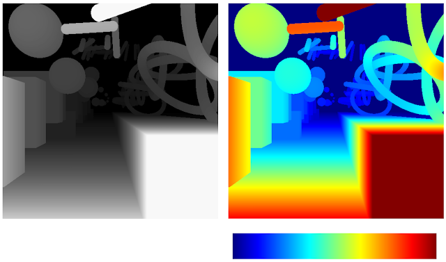
False color maps show up in many applications in computer vision and machine learning, from visualizing depth images to more abstract uses, such as image differencing. Colorizing images helps the human visual system pick out detail, estimate quantitative values, and notice patterns in data in a more intuitive fashion. However, the choice of color map can have a significant impact on a given task. For example, interpretation of “rainbow maps” have been linked to lower accuracy in mission critical applications, such as medical imaging. Still, in many applications, “rainbow maps” are preferred since they show more detail (at the expense of accuracy) and allow for quicker visual assessment.
 |
| Left: Disparity image displayed as greyscale. Right: The commonly used Jet rainbow map being used to create a false color image. |
 |
| The above image with simulated Protanopia |
 |  |
| Viridis | Inferno |
Development
To create the Turbo color map, we created a simple interface that allowed us to interactively adjust the sRGB curves using a 7-knot cubic spline, while comparing the result on a selection of sample images as well as other well known color maps.
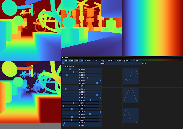 |
| Screenshot of the interface used to create and tune Turbo. |
 |
| Turbo |
 |
| Jet |
Viridis is a linear color map that is generally recommended when false color is needed because it is pleasant to the eye and it fixes most issues with Jet. Inferno has the same linear properties of Viridis, but is higher contrast, making it better for picking out detail. However, some feel that it can be harsh on the eyes. While this isn’t a concern for publishing, it does affect people’s choice when they must spend extended periods examining visualizations.
 |  |
| Turbo | Jet |
 |  |
| Viridis | Inferno |
 |  |
| Inferno | Turbo |
 |  |
| Turbo | Jet |
 |  |
| Viridis | Inferno |
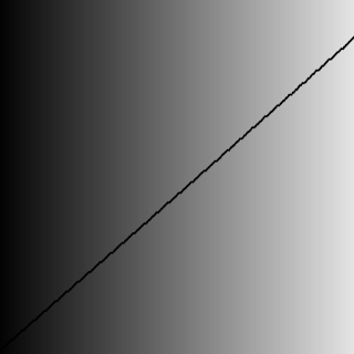
| Lightness plots generated by converting the sRGB values to CIECAM02-UCS and displaying the lightness value (J) in greyscale. The black line traces the lightness value from the low end of the color map (left) to the high end (right). |
Although this low-high-low curve increases detail, it comes at the cost of lightness ambiguity. When rendered in grayscale, the coloration will be ambiguous, since some of the lower values will look identical to higher values. Consequently, Turbo is inappropriate for grayscale printing and for people with the rare case of achromatopsia.
Semantic Layers
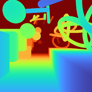
When examining disparity maps, it is often desirable to compare values on different sides of the image at a glance. This task is much easier when values can be mentally mapped to a distinct semantic color, such as red or blue. Thus, having more colors helps the estimation ease and accuracy.
 |  |
| Turbo | Jet |
 |  |
| Viridis | Inferno |
When doing a quick comparison of two images, it’s much easier to judge the differences in color than in lightness (because our attention system prioritizes hue). For example, imagine we have an output image from a depth estimation algorithm beside the ground truth. With Turbo it’s easy to discern whether or not the two are in agreement and which regions may disagree.
 |  |
| “Output” Viridis | “Ground Truth” Viridis |
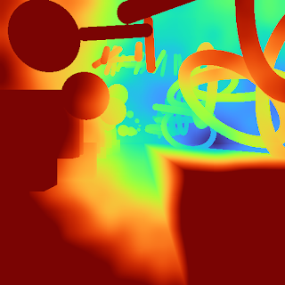 |  |
| “Output” Turbo | “Ground Truth” Turbo |
Diverging Map Use Cases
Although the Turbo color map was designed for sequential use (i.e., values [0-1]), it can be used as a diverging colormap as well, as is needed in difference images, for example. When used this way, zero is green, negative values are shades of blue, and positive values are shades of red. Note, however, that the negative minimum is darker than the positive maximum, so it is not truly balanced.
 |  |
| "Ground Truth" disparity image | Estimated disparity image |
 |
| Difference Image (ground truth - estimated disparity image), visualized with Turbo |
We tested Turbo using a color blindness simulator and found that for all conditions except Achromatopsia (total color blindness), the map remains distinguishable and smooth. In the case of Achromatopsia, the low and high ends are ambiguous. Since the condition affects 1 in 30,000 individuals (or 0.00003%), Turbo should be usable by 99.997% of the population.
 |
| Test Image |
 |  | |
| Protanomaly | Protanopia | |
 |  | |
| Deuteranomaly | Deuteranopia | |
 |  | |
| Tritanomaly | Tritanopia | |
 |  | |
| Blue cone monochromacy | Achromatopsia |
Turbo is a slot-in replacement for Jet, and is intended for day-to-day tasks where perceptual uniformity is not critical, but one still wants a high contrast, smooth visualization of the underlying data. It can be used as a sequential as well as a diverging map, making it a good all-around map to have in the toolbox. You can find the color map data and usage instructions for Python here and for C/C++ here. There is also a polynomial approximation here, for cases where a look-up table may not be desirable.Our team uses it for visualizing disparity maps, error maps, and various other scalar quantities, and we hope you’ll find it useful as well.
Acknowledgements
Ambrus Csaszar stared at many color ramps with me in order to pick the right tradeoffs between uniformity and detail accentuation. Christian Haene integrated the map into our team’s tools, which caused wide usage and thus spurred further improvements. Matthias Kramm and Ruofei Du came up with closed form approximations.

