Heartbeat of the Earth: artists explore climate data
Art has always been a medium to convey complex subjects and address challenges we face. For many of us, the term “climate data” conjures up images of complicated graphs and charts, but artists are explaining it through a new lens. Today, on World Environment Day, the United Nations Framework Convention on Climate Change (UNFCCC) and the Google Arts & Culture Lab residency program announce Heartbeat of the Earth, a series of experimental artworks inspired by climate data.
Five artists—Fabian Oefner, Cristina Tarquini, Laurie Frick, Pekka Niittyvirta, Timo Aho—used key findings from a landmark UN report and data from scientific institutions, including the National Oceanic and Atmospheric Administration (NOAA) and the World Meteorological Organization, to create four interactive pieces of art about our climate. They’ve addressed the topics of declining ocean life, food consumption, melting glaciers and rising sea levels.
-
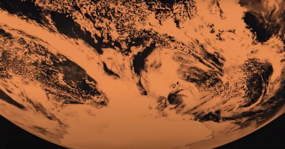
Jump into our ocean to witness declining sea life in artwork "Diving into an Acidifying Ocean".
-

Explore the impact the food we eat has on carbon emissions with “What We Eat”.
-
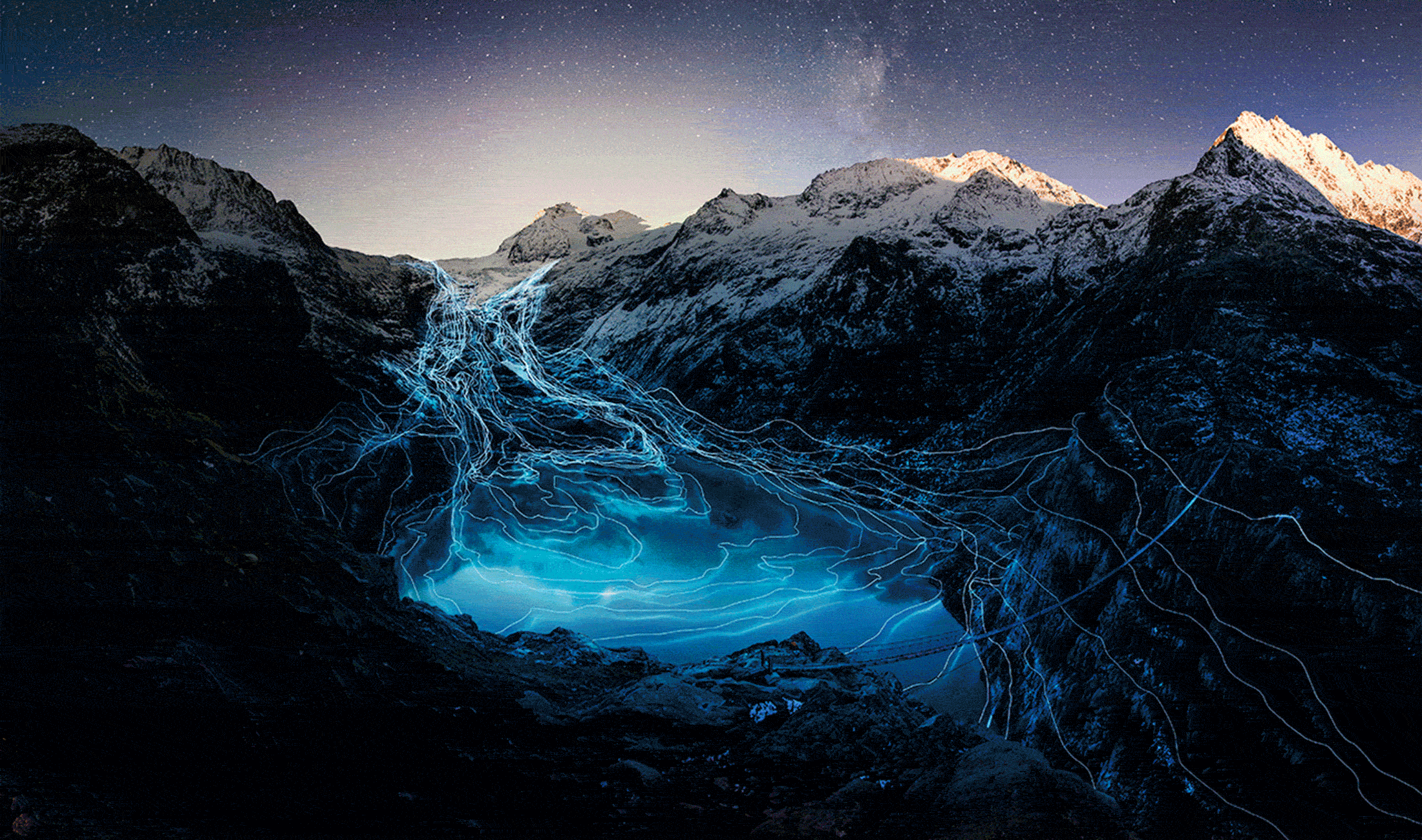
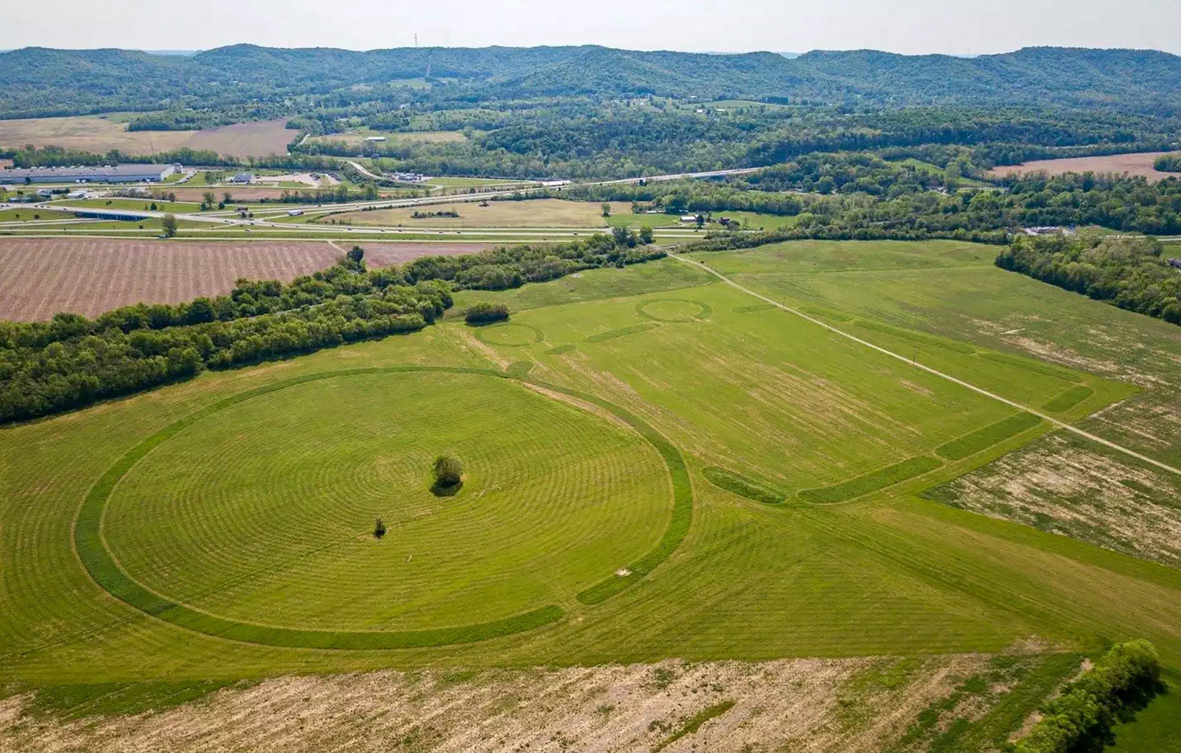
With the help of a drone “Timelines” visualises two melting Swiss glaciers and their retreat over the last 140 years.
-
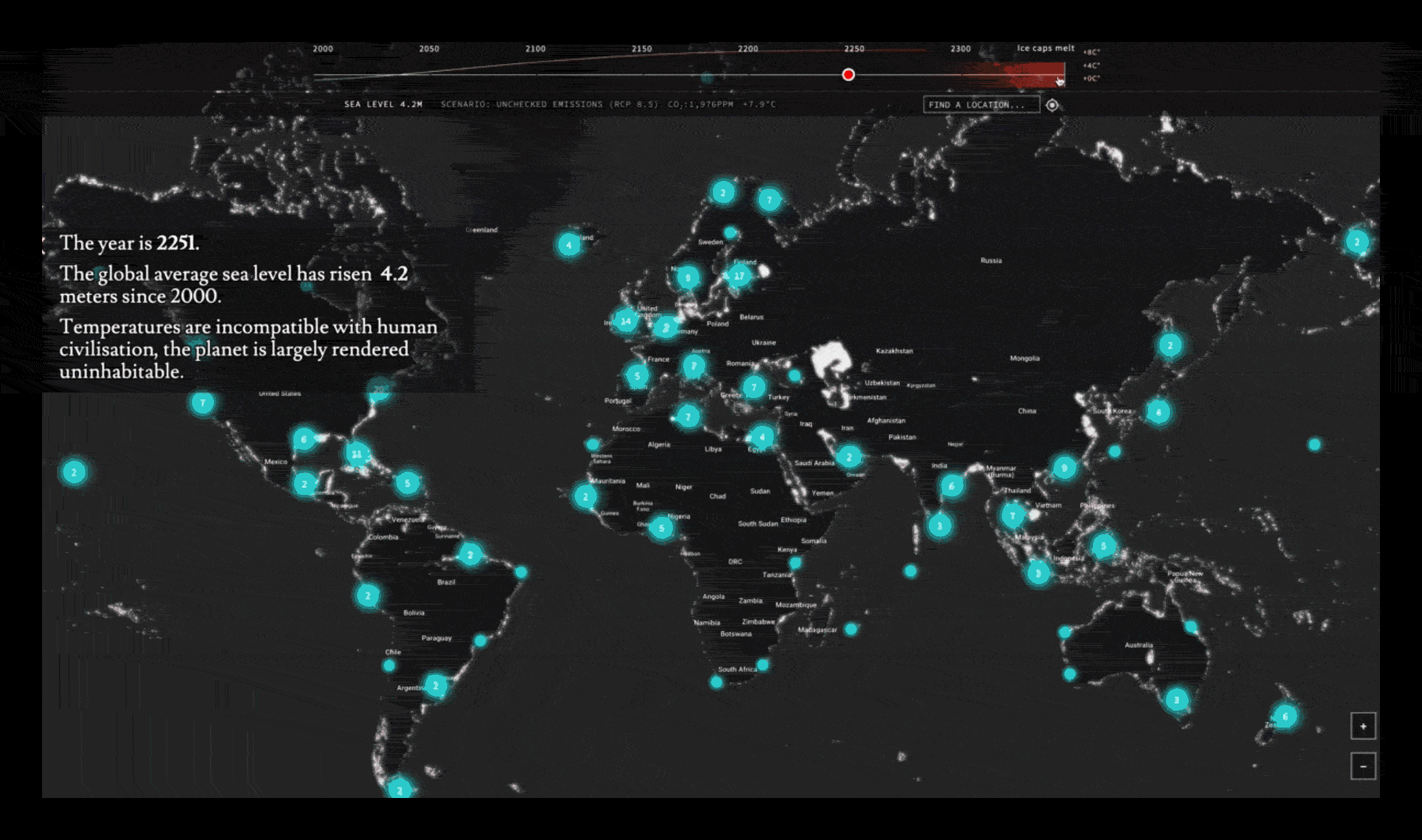
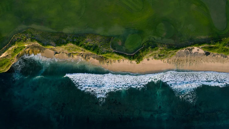
With "Coastline Paradox" you can zoom into a map of the world to see the predicted rise sea levels.
Acidifying Ocean
Digital visual artist Cristina Tarquini invites you to dive into our acidifying oceans using data from NOAA. Witness the effects of rising CO2 levels on our ocean: coral bleaching, fish disappearing, shells dissolving, jellyfish populations booming and garbage overpopulating the sea.
What We Eat
Have you ever wondered about the carbon footprint of your food? One-fourth of global climate change is caused by food production—that’s even more than the damage caused by transportation—so data artist Laurie Frick has created “What We Eat”. The work examines the impact of individual foods on the environment using hand-drawn data visualisations, color coded and sized by CO2 output.
Coastline Paradox
Discover the predicted sea level rise—and the number of people likely to be displaced—in more than 200 different locations between the years 2000 and 2300. Timo Aho & Pekka Niittyvirta’s “Coastline Paradox” experiment, uses a map of the world and Google Street View to visualize the current and predicted global sea level rise.
Timelines
The experimental photographer Fabian Oefner visualizes the shocking retreat of the Rhone and Trift glaciers in Switzerland over the last 140 years. In “Timelines,” Fabian traces their retreat for each year using digital coordinates by GLAMOS, a drone equipped with powerful LED lights, and long-exposure imagery of the drone’s flightpath.
We hope that Heartbeat of the Earth will help everyone learn more about the complex issues we’ll encounter due to a changing climate.
Find out more via g.co/heartbeathoftheearth or on the free Google Arts & Culture app for iOS and Android.
A note from Freya: If you want to keep exploring on World Environment Day, “Into the Deep” is an expedition of the Antarctic ocean, made in partnership with Germany’s Federal Ministry of Education and Research. We also have a new video series celebrating nature in art created in cooperation with BTHVN2020.