Formerly known as the Shared Element Transitions
For help getting started quickly, check out the developer guide for easy to follow steps, and the I/O 2022 talk and codelab about View Transitions for more visuals and help.
View Transitions is a proposal for a new web API that allows a simple set of transition animations in both Single-Page Applications (SPAs) and Multi-Page Applications (MPAs).
The inspiration for this feature are transitions similar to the ones listed in the Material Design Principles.
The intent is to support transitions similar to Android Activity Transitions.
When a user navigates on the web from Page-A to Page-B, the content that they are looking at changes suddenly and unexpectedly as the first page disappears and the new page jumps into view. This sequenced, disconnected user experience is disorienting and results in a higher-cognitive load as the user is forced to piece together how they got to where they came from. Additionally, this jarring experience increases how much users perceive the page loading as they wait for the desired destination to load.
Smooth loading animations can lower the cognitive load by helping users stay in context and better understand the relationship between Page-A and Page-B as they navigate, and it can reduce the perceived latency of loading by providing them with something engaging and delightful in the meantime. For these reasons, most platforms provide easy-to-use primitives that enable developers to build seamless transitions: Android, iOS/Mac and Windows.
View transitions enable you to create transition animations from page A to page B in both single-page applications (SPAs) and multi-page applications (MPAs).
The API is available in Chrome Canary as of version 101 behind a flag at chrome://flags/#document-transition; however, currently it is only functional for SPAs.
Animations in same-origin MPA are targeted as future scope. However, the goal is that using the API for SPA and MPA transitions will be very similar. In the more distant future, the API is planned to be extended to cross-origin cases, with slightly more limited functionality due to security. Cross-origin transitions are not covered in this document.
If using view transitions, the transition occurs when a user navigates to the next page. Transitions help to make the context switch feel smooth and connected, and it is important to choose the best transition for the navigation.
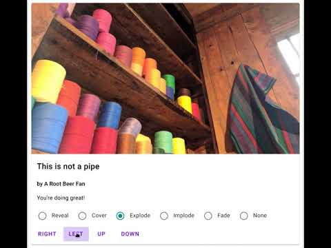
Root transitions are those where one page transitions into the next. For example, think of Page-A sliding left as Page-B is revealed and slides in next to it. This can be useful for when one page should follow the other in the user’s browsing sequence. A good use case for this is if the user is looking at one article and wants to read another related one after.
Other types of root transitions may include an explode/implode, a cover or a fade.
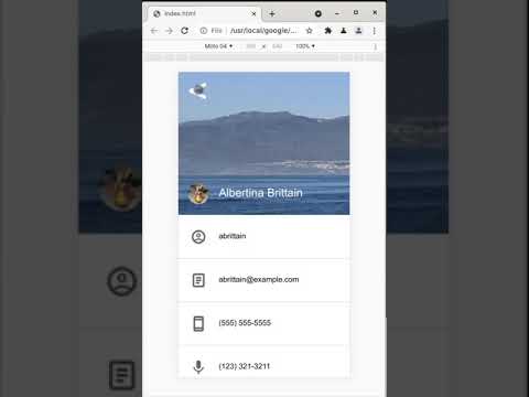
Element transitions are those where a specified element (one that exists both on Page-A and Page-B) transitions during the navigation. This can induce the feeling of context continuity and help the user understand the relationship of the content. For example, a user clicks on a product image from a product list. The product image grows and moves into place as the next page, the product details page, shows up.
It is important to note that this API does not have a separate definition of root and element transitions, and that it is up to the developer to tag the desired elements and provide CSS for how to animate them. If the developer does not choose to customize the transition, the default will be animating the size and position of the two elements and crossfading between the before and after visuals.
For more information on how this API works, please refer to the explainer here.
To get started with element transitions today, enable the API via chrome://flags/#document-transition.
In order to use View transitions, first the developer must select the element. This will be the element that animates independently during the transition, and it will be captured as a single image (i.e. the captured painting of the element includes things that appear outside its bounding box like shadows, blurs, etc.).
The captured elements are displayed using a tree of pseudo-elements, and are accessible to the developer to customize via CSS. If the developer does not choose to add customization, a default will occur where the size and position of the two elements are animated, and the before / after visuals are crossfaded into each other.
Page-B will also identify elements on its own page that are involved in the transition before the transition can begin. With a touch more magic (see the explainer here), the transition can begin. It is important to note that the browser will not start the animation or display elements from Page-B until Page-B is ready for first render.
For more information on how this API works, please refer to the explainer here.